Push the limits of machine learning explainability
an ultimate guide to SHAP library
Skills
- data science
- interpretability
- XAI
- machine learning
- explainable AI
- Python
Summary - A Comprehensive Guide to SHAP: Enhancing Machine Learning Interpretability
This article is a guide to the advanced and lesser-known features of the python SHAP library. It is based on an example of tabular data classification.
But first, let’s talk about the motivation and interest in explainability at Saegus that motivated and financed my explorations.

The Theory Behind Explainability in AI and Machine Learning
The explainability of algorithms is taking more and more place in the discussions about Data Science. We know that algorithms are powerful, we know that they can assist us in many tasks: price prediction, document classification, video recommendation.
From now on, more and more questions are being asked about this
prediction:
- Is it ethical?
- Is it affected by bias?
- Is
it used for the right reasons?
In many domains such as medicine, banking or insurance, algorithms can be used if, and only if, it is possible to trace and explain (or better, interpret) the decisions of these algorithms.
Key Terminology in Machine Learning Interpretability and SHAP
In this article we would like to distinguish the terms:
Explainability: possibility to explain from a technical point of view the prediction of an algorithm.
Interpretability: the ability to explain or provide meaning in terms that are understandable by a human being.
Transparency: a model is considered transparent if it is understandable on its own.
Why Explainability Matters in Data Science ?
Interpretability helps to ensure impartiality in decision-making, i.e. to detect and therefore correct biases in the training data set. In addition, it facilitates robustness by highlighting potential adverse disturbances that could change the prediction. It can also act as an assurance that only significant features infer the outcome.
Sometimes, it would be more advisable to abandon the machine learning approach, and use deterministic algorithms based on rules justified by industry knowledge or legislation [1].
Nevertheless, it is too tempting to access the capabilities of machine learning algorithms that can offer high accuracy. We can talk about the trade-off between accuracy and explainability. This trade-off consists in discarding more complex models such as neural networks for simpler algorithms that can be explained.
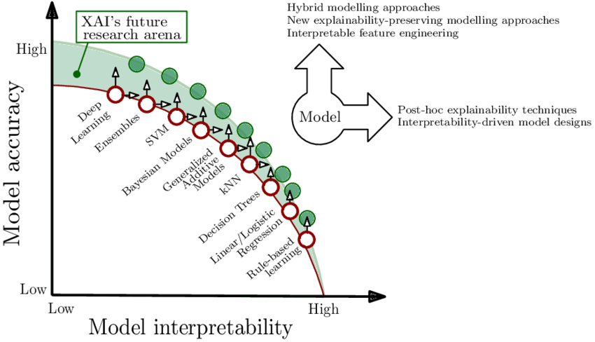 As described in [2] relation between interpretability and accuracy of the
model. For some models improvements can be made towards a more
interpretable or more relevant model.
As described in [2] relation between interpretability and accuracy of the
model. For some models improvements can be made towards a more
interpretable or more relevant model.
To achieve these goals, a new field has emerged: XAI (Explainable Artificial Intelligence), which aims to produce algorithms that are both powerful and explainable.
Many frameworks have been proposed to help explain non-transparent algorithms. A very good presentation of these methods can be found in the Cloudera white paper [3].
In this article we will deal with one of the most used frameworks: SHAP.
Exploring the Audience for Explainable AI in Data Science
Different profiles interested in expainability or interpretability have been identified:
- Business expert/model user — in order to trust the model, understand the causality of the prediction
- Regulatory bodies to certify compliance with the legislation, auditing
- Managers and executive board to assess regulatory compliance, understand enterprise AI applications
- Users impacted by model decisions in order to understand the situation, verify decisions
- Data scientist, developer, PO to ensure/improve product performance, find new features, explain functioning/predictions to superiors
In order to make explainability accessible to people with low technical skills, first of all, the creator: a data scientist/developer must be comfortable with the tools of explainability.
The data scientist will use them above all to understand and improve his
model and then to communicate with his superiors and regulatory bodies.
Recently,
explainability tools have become more and more accessible.
For example, Dataiku — ML’s platform — has added in its latest version 7.0 published on March 2, 2020 explainability tools: Shapley values and “The Individual Conditional Expectation” (ICE).
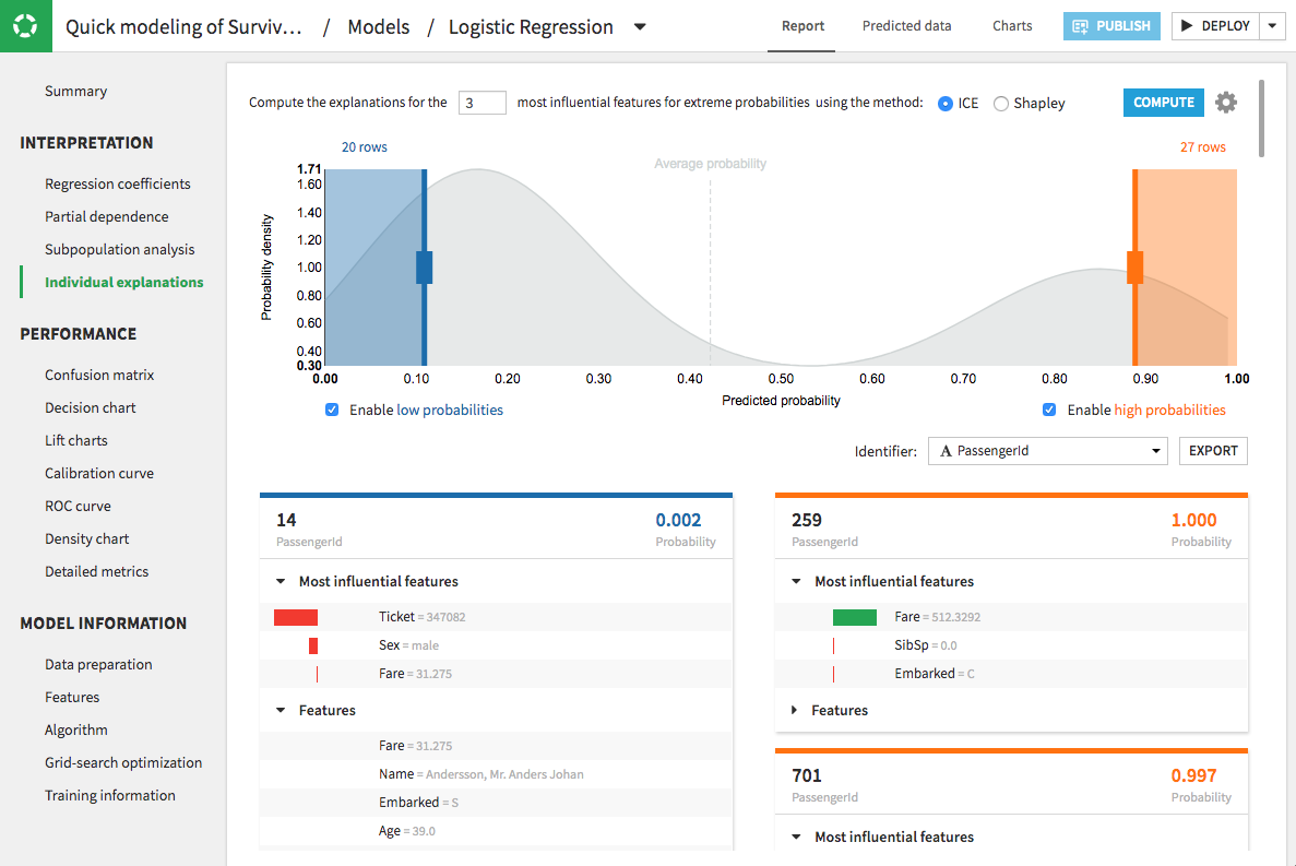 Dataiku prediction studio
Azure ML proposes its own version of Shap and alternative tools adding interactive dashboards.
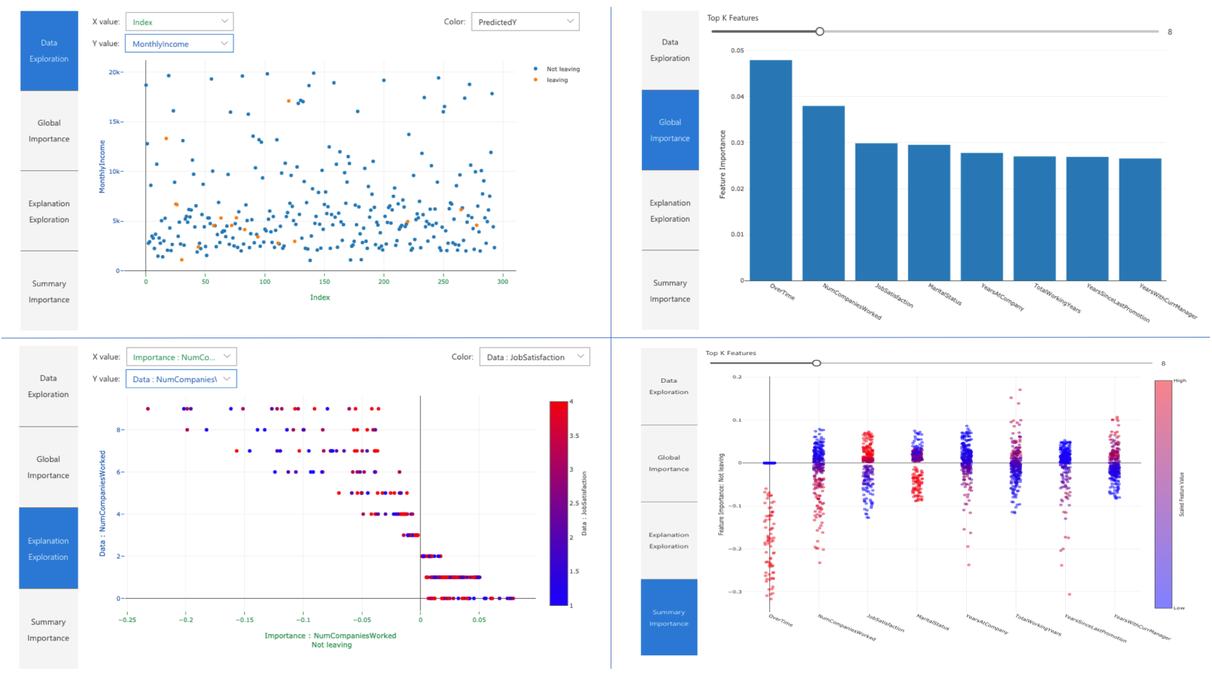 Azure ML interpretability dashboard
There are also open-source webapps such as this one described in the medium article [4] that facilitate the exploration of the SHAP library.
There are dangers in having models running the world and making decisions from hiring to criminal justicetowardsdatascience.com
These tools, very interesting to get a quick overview of interpretation, do not necessarily give an understanding of the full potential of the SHAP library. Few allow to explore interaction values or to use different background or display sets.
I investigated the SHAP framework and I present you my remarks and the usage of less known features, available in the official version of the library in open source. I also propose some interactive visualizations easy to integrate in your projects.
Step-by-Step Guide: Using SHAP for Machine Learning Models
Most data scientists have already heard of the SHAP framework.
In this
post, we won’t explain in detail how the calculations behind the library are
done. Many resources are available online such as the SHAP documentation
[5], publications by authors of the library [6,7], the great book
“Interpretable Machine Learning” [8] and multiple medium articles [9,10,11].
In summary, Shapley’s values calculate the importance of a feature by comparing what a model predicts with and without this feature. However, since the order in which a model sees the features can affect its predictions, this is done in all possible ways, so that the features are compared fairly. This approach is inspired by game theory.
Having worked with many clients, for example in the banking and insurance sectors, one can see that their data scientists are struggling to exploit the full potential of SHAP. They don’t know how this tool could really be useful for understanding a model and how to use it to go beyond simply extracting the importance of features.
The devil is in the detail
SHAP comes with a set of visualizations that are quite complex and not always intuitive, even for a data scientist.
On top of that, there are several technical nuances to be able to use SHAP with your data. Francesco Porchetti’s blog article [12] expresses some of these frustrations by exploring the SHAP, LIME, PDPbox (PDP and ICE) and ELI5 libraries.
At Saegus, I worked on a course which aims to give more clarity to the SHAP framework and to facilitate the use of this tool.
In this post I would like to share with you some observations collected during that process.
SHAP is used to explain an existing model. Taking a binary classification case built with a sklearn model. We train, tune and test our model. Then we can use our data and the model to create an additional SHAP model that explains our classification model.
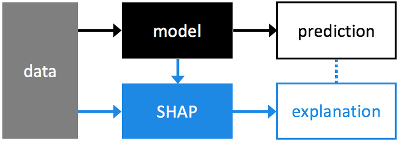 Image source: SHAP github
Vocabulary
It is important to understand all the bricks that make up a SHAP explanation.
Often, by using default values for parameters, the complexity of the choices we make remains obscure.
global explanations
explanations of how the model
works from a general point of view
local explanations
explanations of the model for a
sample (a data point)
explainer (shap.explainer_type(params))
type of
explainability algorithm to be chosen according to the model used.
The parameters are different for each type of model. Usually, the model and training data must be provided, at a minimum.
base value (explainer.expected_value)
E(y_hat)
is “the value that would be predicted if we didn’t know any features of the
current output” is the mean(y_hat) prediction for the training data
set or the background set. We can call it “reference value”, it’s a scalar
(n).
It’s important to choose your background set carefully — if we have the unbalanced training set this will result in a base value placed among the majority of samples. This can also be a desired effect: for example if for a bank loan we want to answer the question: “how is the customer in question different from customers who have been approved for the loan” or “how is my false positive different from the true positives”.
 # equilibrated case background = X.sample(1000) #X is
  equilibrated # background used in explainer defines base value explainer =
  shap.TreeExplainer(xgb_model,background,model_output="raw" ) shap_values =
  explainer.shap_values(X) # background used in the plot, the points that are
  visible on the plot shap.summary_plot(shap_values,background,
  feature_names=background.columns)
#
base value shifted class1 = X.loc[class1,:] #X is equilibrated # background
from class 1 is used in explainer defines base value explainer =
shap.TreeExplainer(xgb_model,class1,model_output="raw" ) shap_values =
explainer.shap_values(X) # points from class 0 is used in the plot, the points
that are visible on the plot shap.summary_plot(shap_values,X.loc[class0,:],
feature_names=X.columns) 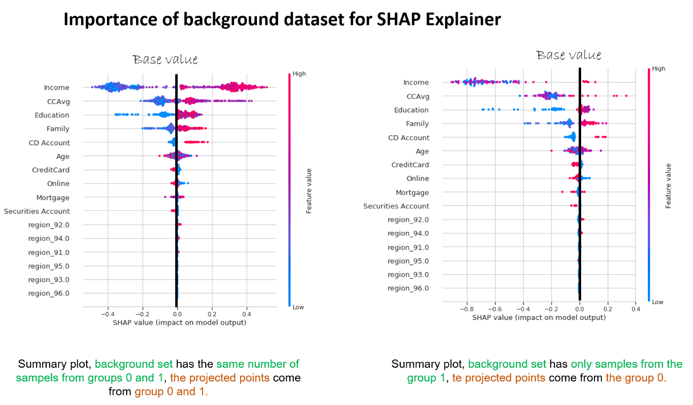 Selecting the background dataset changes the question answered by
shap values.
Selecting the background dataset changes the question answered by
shap values.
SHAPley values (explainer.shap_values(x))
the average
contribution of each feature to each prediction for each sample based on all
possible features. It is a (n,m) n — samples,
m — features matrix that represents the contribution of each
feature to each sample.
output value (for a sample)
the value predicted by the
algorithm (the probability, logit or raw output values of the model)
display features (n x m)
a matrix of
original values — before transformation/encoding/engineering of features
etc. — that can be provided to some graphs to improve interpretation. Often
overlooked and essential for interpretation.
____
SHAPley values
Shapley values remain the central element. Once we realize that this is simply a matrix with the same dimensions as our input data and that we can analyze it in different ways to explain the model and not only. We can reduce its dimensions, we can cluster it, we can use it to create new features. An interesting exploration described in the article [12] aims at improving anomaly detection using auto encoders and SHAP. The SHAP library proposes a rich but not exchaustive exploration through visualizations.
Visualizing SHAP: Enhancing Interpretability in Deep Learning Models
The SHAP library offers different visualizations. A good explanation on how to read the colors of the summary plot can be found in this medium article [14].
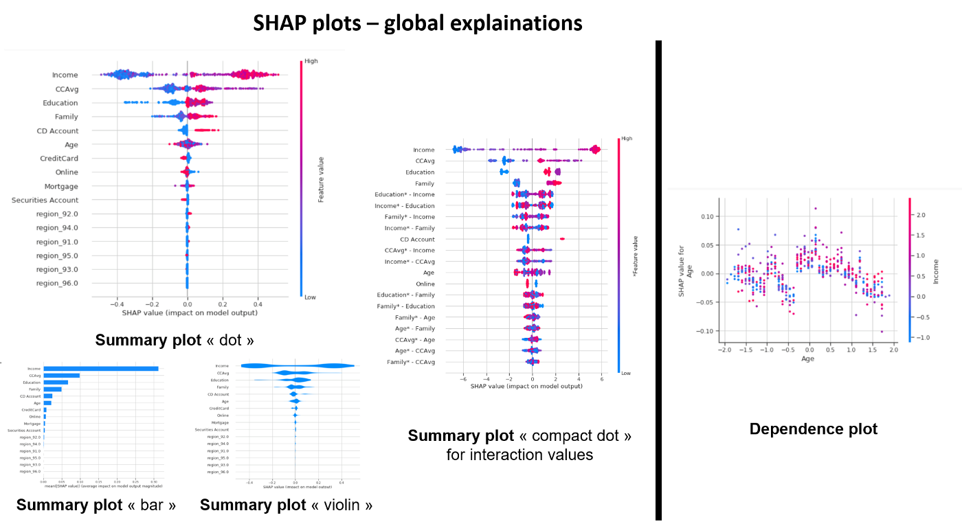 A summary of graphical visualizations to analyze global explanations
The summary plot shows the most important features and the magnitude of their impact on the model. It can take several graphical forms and for the models explained by TreeExplainer we can also observe the interaction values using the “compact dot” with shap_interaction_values in input.
The dependency plot allows to analyze the features two by two by suggesting a possibility to observe the interactions. The scatter plot represents a dependency between a feature(x) and the shapley values (y) colored by a second feature(hue).
On a personal note, I find that an observation of a three-factor relationship at the same time is not intuitive for the human brain (at least mine). I also doubt that an observation of dependency by observing colours can be scientifically accurate. Shap can give us an interaction relationship that is calculated as a correlation between the shapley values of the first feature and the values of the second feature. If possible (for TreeExplainer) it makes more sense to use the shapley interaction values to observe interactions.
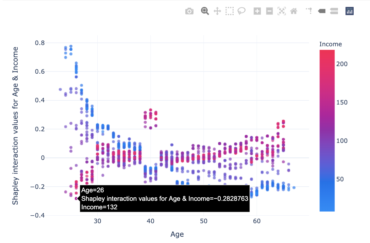
I propose an interactive variant of dependency plot that allows to observe the relationship between a feature(x), the shapley values (y) and the prediction (histogram colors). What seems important to me in this version is the possibility to display on the graph the original values (Income in k USD) instead of the normalized space used by the model.
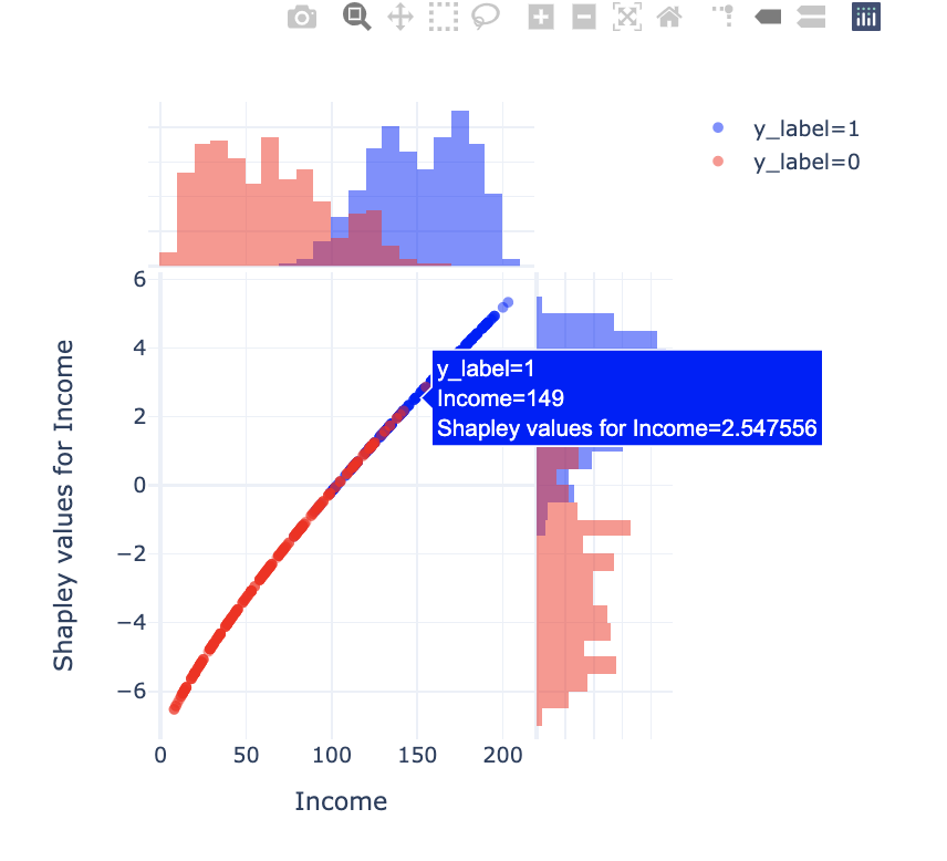 My variant of dependence plot
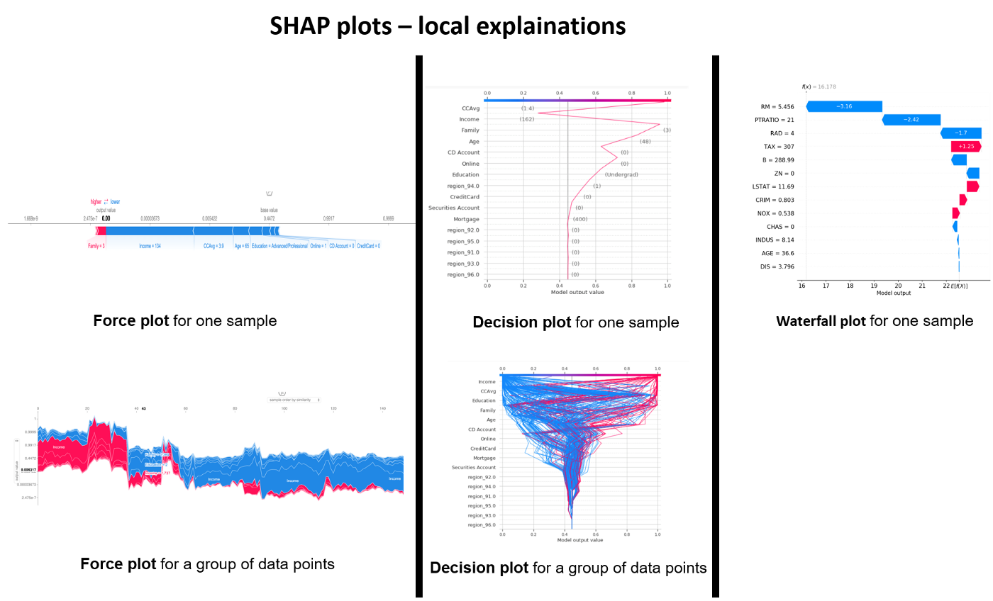 a summary of graphical visualizations to analyze local explanations
There are three alternatives for the visualization of explanations of a sample: force plot, decision plot and waterfall plot.
For a sample, these three representations are redundant, they represent the information in a very similar way. At the same time, some elements of these graphs are complementary. By putting the three side by side, I have the impression to understand the result in a more intuitive way. The force plot is good to see where the “output value” fits in relation to the “base value”. We also see which features have a positive (red) or negative (blue) impact on the prediction and the magnitude of this impact. The water plot also allows us to see the amplitude and the nature of the impact of a feature with its quantification. It also allows to see the order of importance of the features and the values taken by each feature for the studied sample. The Decision plot makes it possible to observe the amplitude of each change, “a trajectory” taken by a samplefor the values of the displayed features.
By using force plot and decision plot we can represent several samples at the same time.
The force plot for a set of samples can be compared to the last level of a dendrogram. The samples are grouped by similarity or by selected feature. In my opinion, this graph is difficult to read for a random sample. It is much more meaningful if we represent the contrasting cases or with a hypothesis behind.
The decision plot, for a set of samples, quickly becomes cumbersome if we select too many samples. It is very useful to observe a ‘trajectory deviation’ or ‘diverging/converging trajectories’ of a limited group of samples.
Explainers in SHAP: Understanding Different Model Interpretability Approaches
Explainers are the models used to calculate shapley values. The diagram below shows different types of Explainers.
The choice of Explainers depends mainly on the selected learning model. For linear models, the “Linear Explainer” is used, for decision trees and “set” type models — “TreeExplainer”. “Kernel Explainer” is slower than the above mentioned explainers.
In addition the “Tree Explainer” allows to display the interaction values (see next section). It also allows to transform the model output into probabilities or logloss, which is useful for a better understanding of the model or to compare several models.
The Kernel Explainer creates a model that substitutes the closest to our model. Kernel Explainer can be used to explain neural networks. For deep learning models, there are the Deep Explainer and the Grandient Explainer. For this paper we have not investigated the explainability of neural networks.
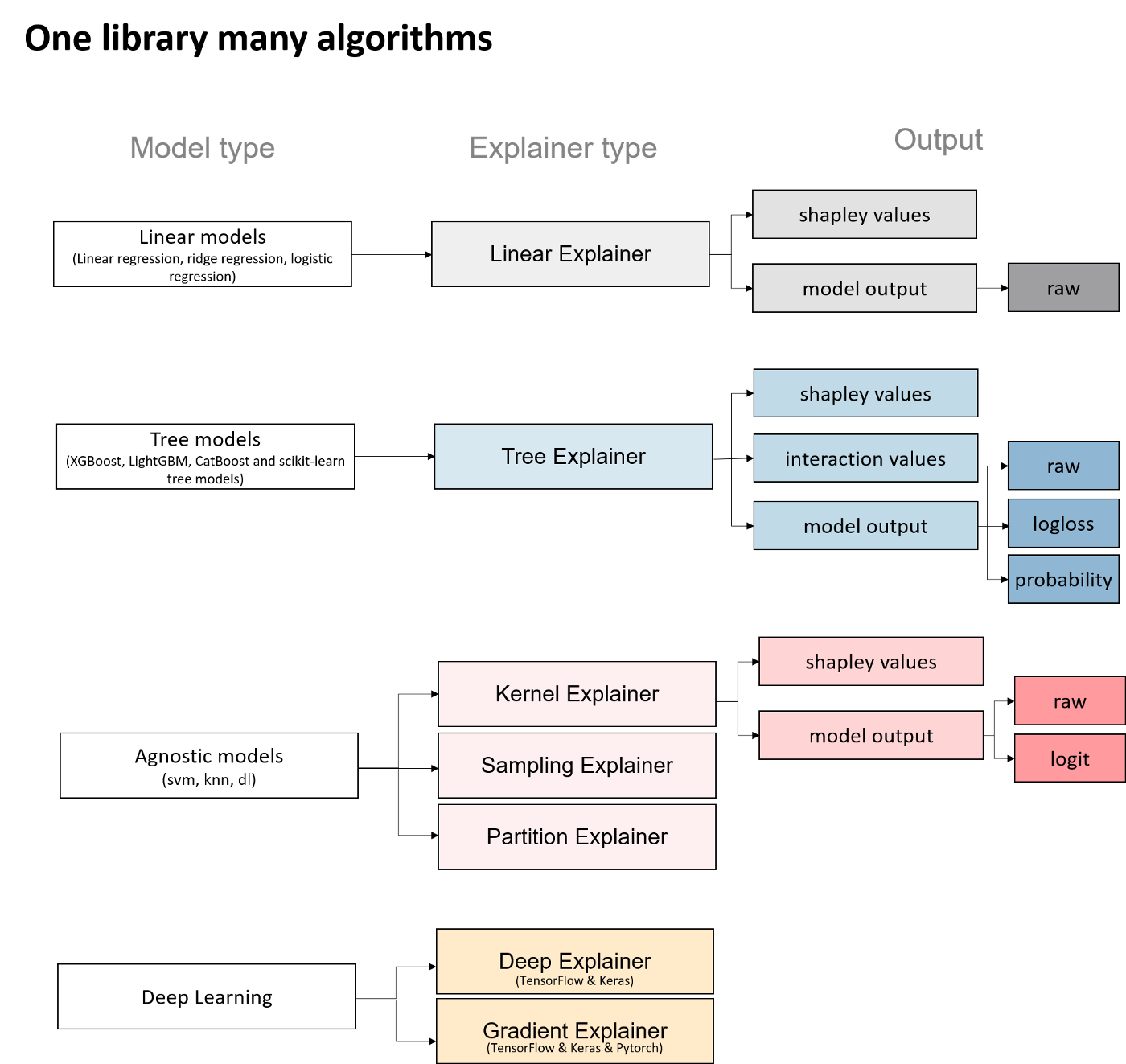 a summary of Explainer types in the SHAP library
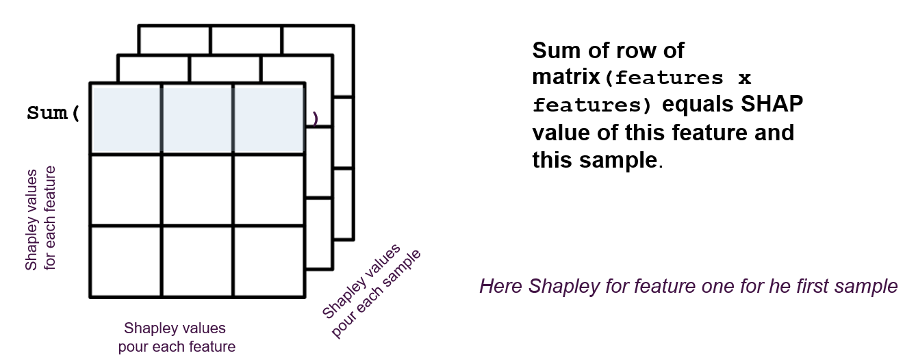
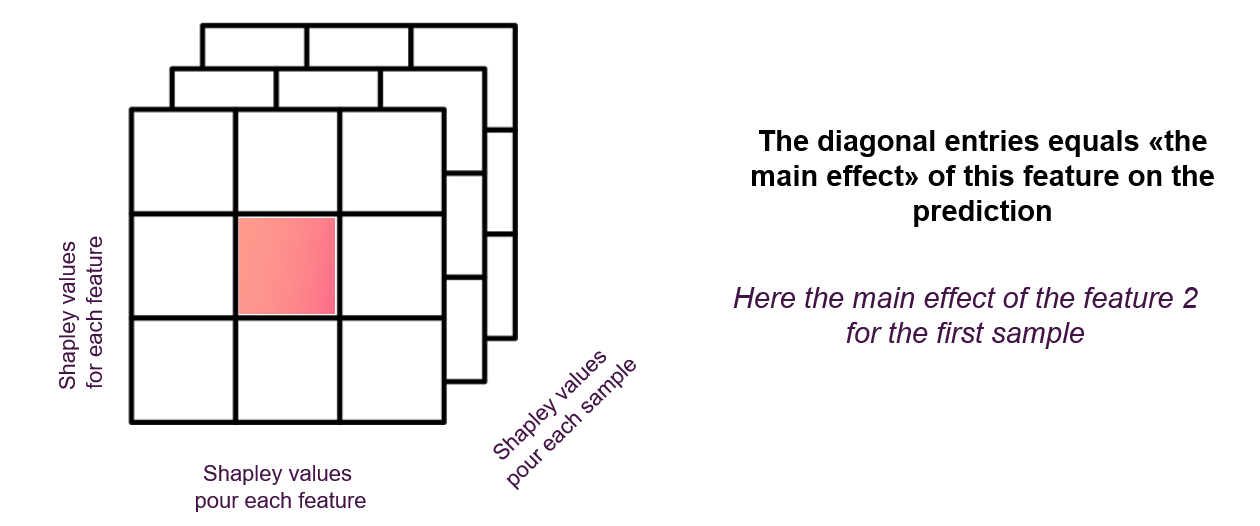
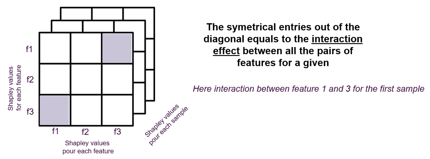
Shapley values of interactions
One of the properties that allows to go further in the analysis of a model that can be explained with the “Tree Explainer” is the calculation of shapley values of interactions.
These values make it possible to quantify the impact of an interaction between two features on the prediction for each sample. As the matrix of shapley values has two dimensions (samples x features), the interactions are a tensor with three dimensions (samples x features x features).
 a summary of graphical visualizations to analyze local explanations
 a summary of graphical visualizations to analyze local explanations
 a summary of graphical visualizations to analyze local explanations
Here’s how interaction values help interpret a binary classification model.
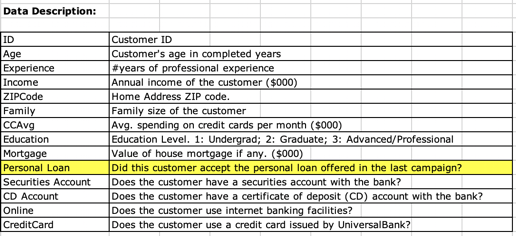
I used a Kaggle [15] dataset that represents a client base and the binary dependent feature: did the client accept the personal loan? NO/YES (0/1).
 a summary of graphical visualizations to analyze local explanations
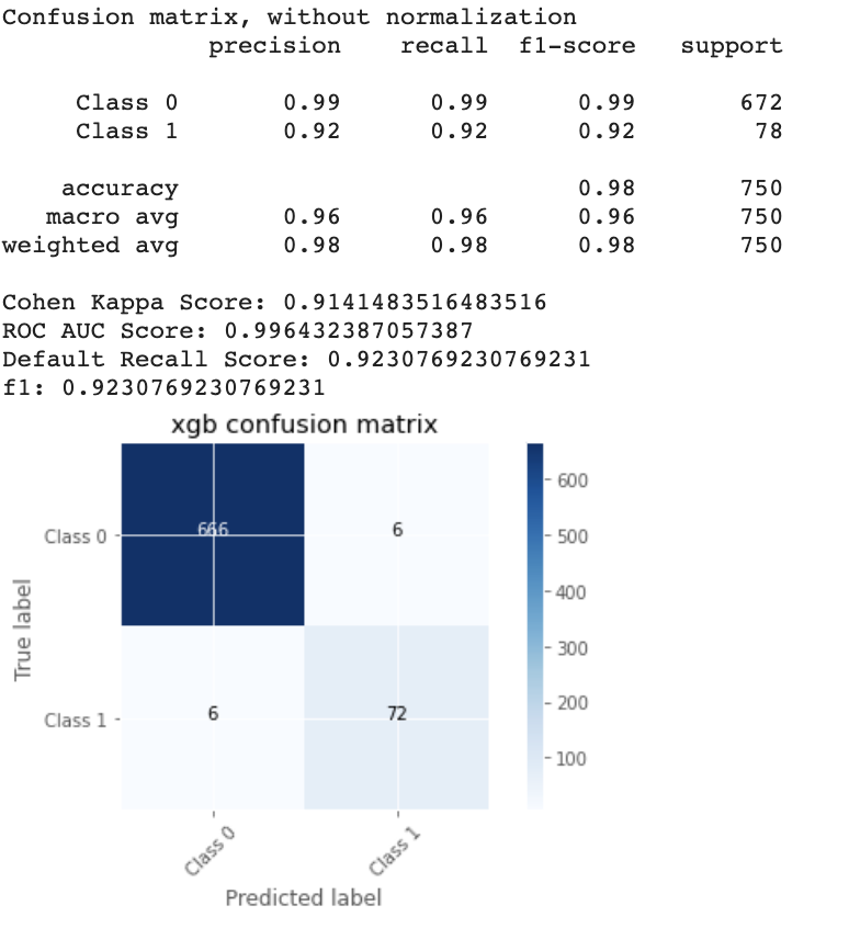
I’ve trained several models, including an xgboost model that we treated with the Tree Explainer.
 a summary of graphical visualizations to analyze local explanations
The background dataset was balanced and represented 40% of the dataset.
# xgb - traned model # X_background - background
dataset explainer_raw = shap.TreeExplainer(xgb,X_background,
model_output="raw", feature_perturbation="tree_path_dependent" ) # project
data point of background datasetshap_values =
explainer_raw.shap_values(X_background) # obtain interaction values
shap_interaction_values = explainer_raw.shap_interaction_values(X_background)
# dimensions shap_values.shape >>>(2543, 16) shap_interaction_values.shape
>>>(2543, 16, 16) shap.summary_plot(shap_interaction_values, X_background,
plot_type="compact_dot") 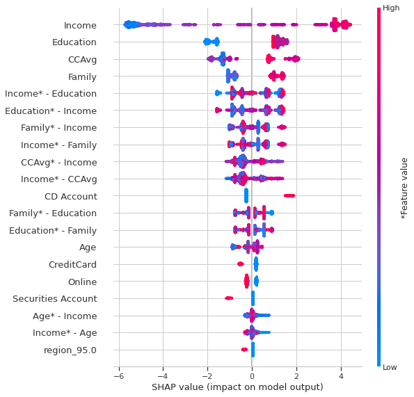 Summary plot with interactions
To better explore interactions, a heatmap can be very useful.
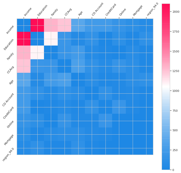 Histogram of interaction values
In the Summary_plot one can observe the importance of features and the importance the interactions. The interactions appear in double which confuses a little the reading.
In the histogram, we observe directly the interactions. The strongests of them of being: Income-Education, Income — Family, Income — CCAvg and Family-Education, Income-Age.
Then I investigated the interactions two by two.
To understand the
difference between a dependency_plot and a dependency_plot of interactions
here are the two:
 # dependence_plot classique shap.dependence_plot("Age",
  shap_values, features= X_background, display_features=X_background_display,
interaction_index="Income") 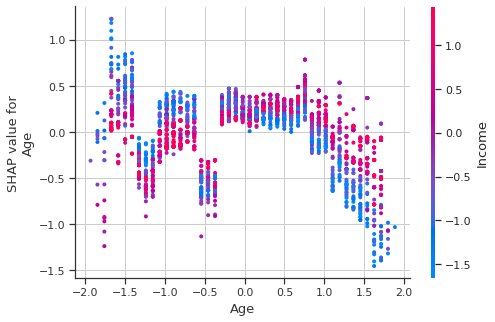
 # dependence_plot des interactions
  shap.dependence_plot(("Age","Income"), shap_interaction_values, features=
X_background,display_features=X_background_display) 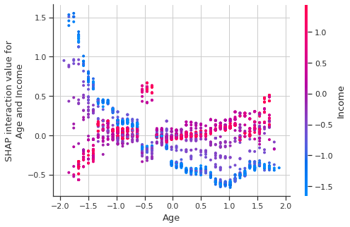
Even when using the ‘display_features’ parameter, the Age and Income values are displayed in the transformed space.
For this reasons I offer an interactive version, which displays the non-transformed values.
And here is the code to reproduce this plot:
Here we have the strongest interactions:
Income — Education
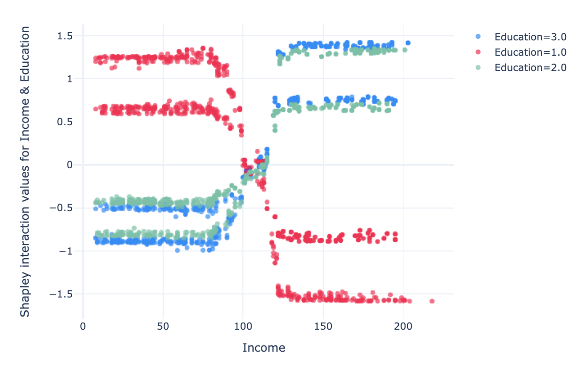
In this graph, we notice that with an Education level 1 (undergrad), low
income (under 100 k USD) is an encouraging factor to take a credit, and high
income (over 120 k USD) is an inhibiting interaction.
For individuals
with Education 2 & 3 (graduated & advanced/professional), the
interaction effect is slightly lower and opposite to that for Education ==
1.
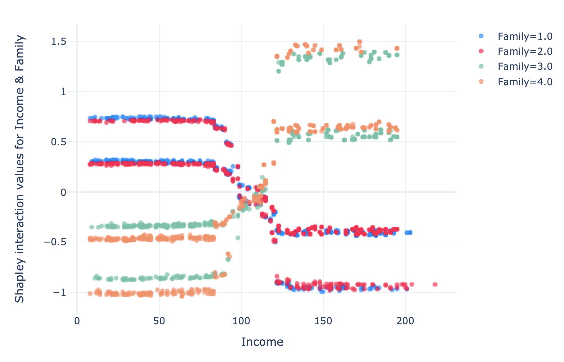
For the features “Family” and “number of people” in the household, the interaction is positive when income is low (below USD 100k) and the family has 1–2 members. For higher incomes (> 120 k USD), for family with 1–2 members has a negative effect. The opposite is true for families of 3–4 people.
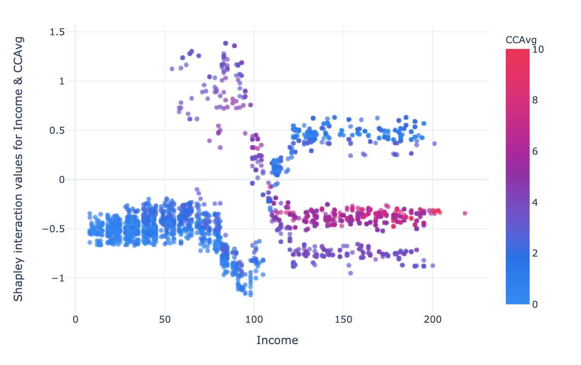
The interaction between income and credit card average spending is more complex. For low income (<100 k USD) and low CCAvg (<4 k USD) the interaction has a negative effect, for income between 50 and 110 k USD and CCAvg 2–6 k USD the effect is strongly positive, this could define a potential target for credit canvassing along these two axes. For high incomes (> 120 k USD), the low CCAvg has a positive impact on the prediction of class 1, high CCAvg has a small negative effect on the predictions, the medium CCAvg has a stronger negative impact.
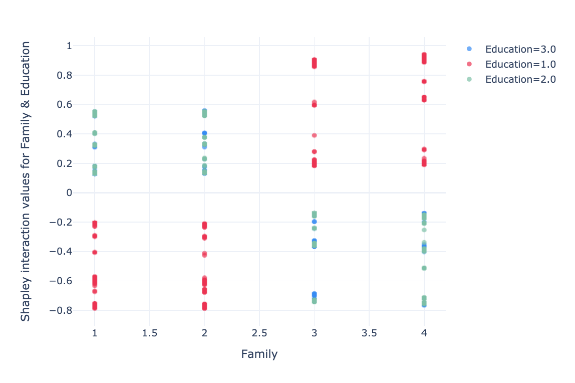
The interaction between two features is a little less readible. For a family of 1 and 2 members with “undergrad” education, the interaction has a negative impact. For a family of 3–4 members the effect is the opposite.
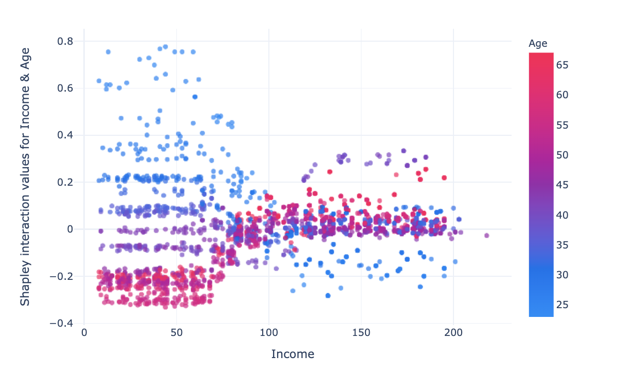
For low incomes (< 70k USD), impact changes linearly with age, the higher the age, the more the impact varies positively. For high incomes (>120k USD), the interaction impact is lower, at middle age (~40 years) the impact is slightly positive, at low age the impact is negative and for age >45 the impact is neutral.
These findings would be more complicated to interpret if the values of the features had not corresponded to original values. For instance, speaking of age or income in negative in units. Therefore, representing explanations in an understandable dimension facilitates interpretation.
Comparing Models: How SHAP Improves Machine Learning Interpretability
In some situations, we may want to compare the predictions of different
models for the same samples. Understand why one model classifies the sample
correctly and the other one does not.
To start, we can display the
summary plots for each model, look at the importance of features and the
shapley value distributions. This gives a first general idea.
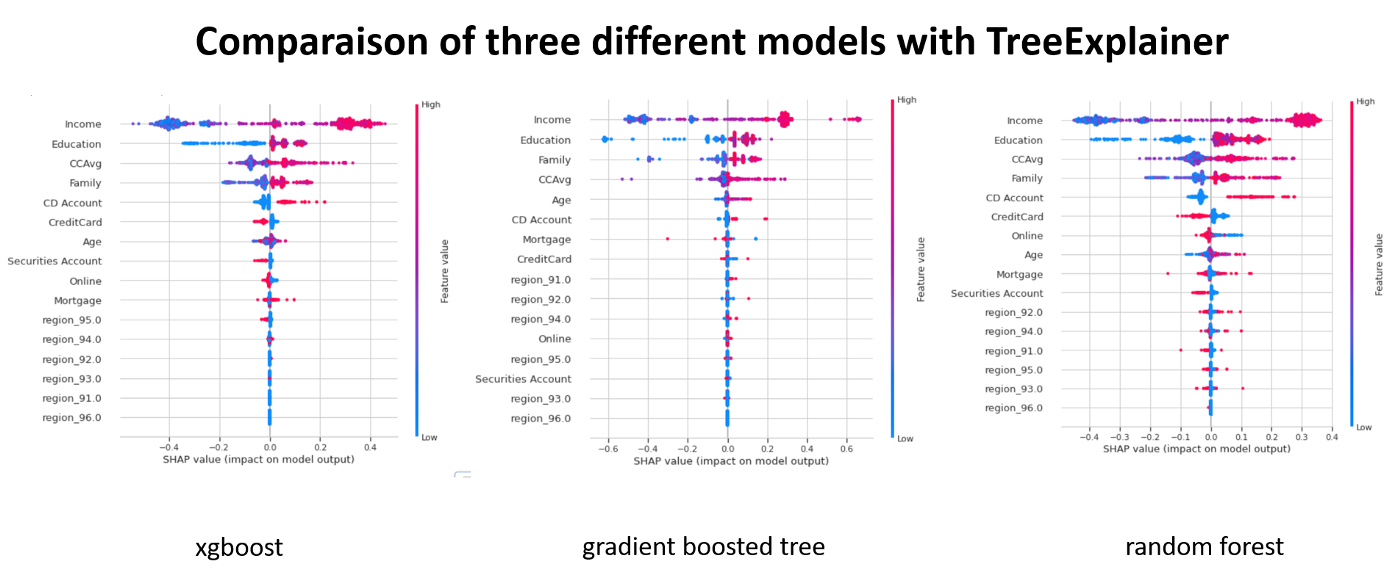
Decision plot allows to compare on the same graph the predictions of
different models for the same sample.
You just have to create an object
that simulates multiclass classification.
 # we have tree models : xgb, gbt, rf # for each model
  we get an explainer(*_explainer), probabilities (*_probs), predictions
  (*_pred) and shapley values(*_values) #xgb xgb_explainer =
  shap.TreeExplainer(xgb, X_background, model_output="probability",
  feature_perturbation="interventional") xgb_values =
  xgb_explainer.shap_values(X_background) xgb_probs =
  xgb.predict_proba(pipeline_trans.transform(x_background)) xgb_pred =
  xgb.predict(pipeline_trans.transform(x_background)) # rf rf_explainer =
  shap.TreeExplainer(rf, X_background, model_output="probability",
  feature_perturbation="interventional") rf_values =
  rf_explainer.shap_values(X_background) rf_probs =
  rf.predict_proba(pipeline_trans.transform(x_background)) rf_pred =
  rf.predict(pipeline_trans.transform(x_background)) # gbt gbt_explainer =
  shap.TreeExplainer(gbt, X_background, model_output="probability",
  feature_perturbation="interventional") gbt_values =
  gbt_explainer.shap_values(X_background) gbt_probs =
  gbt.predict_proba(pipeline_trans.transform(x_background)) gbt_pred =
  gbt.predict(pipeline_trans.transform(x_background)) ######## # we make a list
  of model explaners base_values = [xgb_explainer.expected_value,
  rf_explainer.expected_value[1], gbt_explainer.expected_value] shap_values =
  [xgb_values, rf_values[1], gbt_values] predictions =
  [xgb_probs,rf_probs,gbt_probs] labels = ["xgb", "rf", "gbt"] # index of a
  sample # Plot idx = 100 shap.multioutput_decision_plot(base_values,
  shap_values, idx,
  feature_names=X_background.columns.to_list(),legend_labels=labels,
legend_location='lower right') 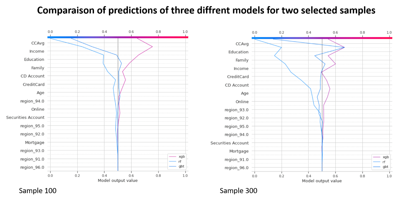
The only difficulty consists in checking the dimensions of shapley values because for some models, shapley values are calculated for each class, in the case of the binary classification (class 0 and 1), while for others we obtain a single matrix which corresponds to class 1. In our example, we select a second matrix (index 1) for random forest.
Running Simulations with SHAP: Enhancing Model Predictions in Data Science
By default SHAP does not contain functions that make it easier to answer the
“What if?” question. “What if I could earn an extra 10K USD a year, would my
credit be extended?”
Nevertheless, it is possible to run the
simulations by varying a feature and calculating hypothetical shapley
values.
 explainer_margin_i =
  shap.TreeExplainer(xgb,X_background, model_output="raw",
  feature_perturbation="interventional") idx = 100 rg = range(1, 202, 10) r, R,
  hypothetical_shap_values, hypothetical_predictions, y_r =
  simulate_with_shap(x_background, 100, "Income", rg, explainer_margin_i,
  pipeline_trans=pipeline_trans)
I created a `simulate_with_shap` function that simulates different values of the feature and calculates the hypothetical shapley values.
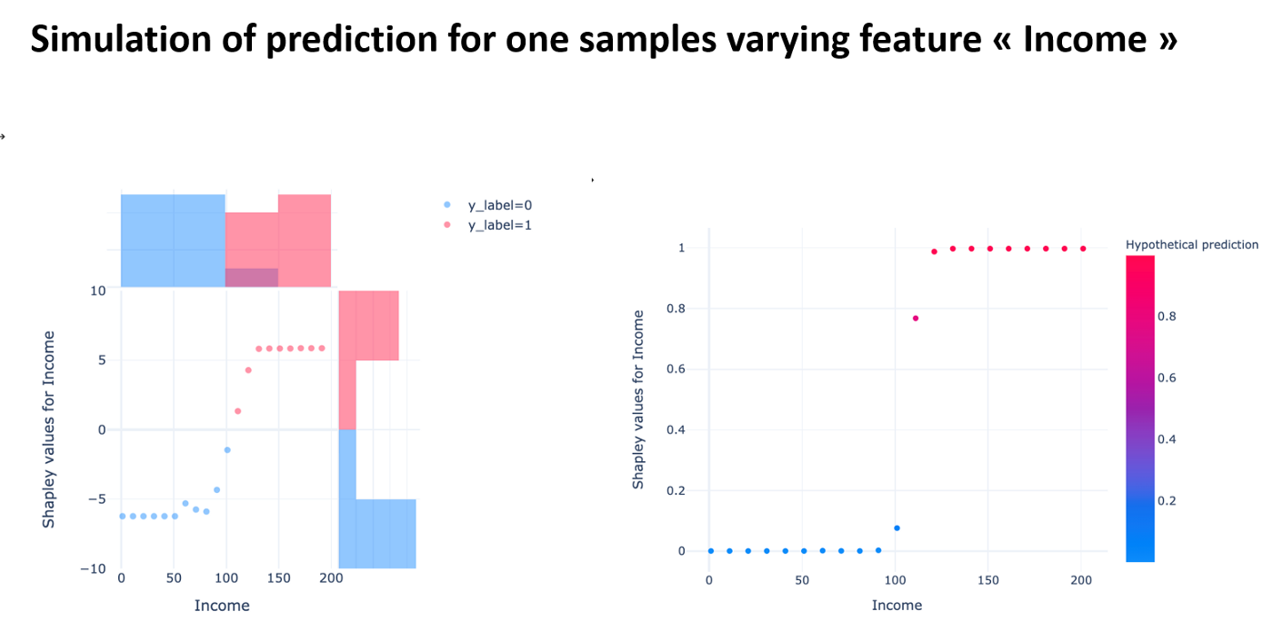
This simulation allows us to see for the selected sample, if we freeze all the features apart from Income, how we could change the prediction and what the shapley values would be for these new values.
It is possible to simulate the changes ‘feature by feature’, it would be interesting to be able to make several changes simultaneously.
Future Trends in Data Science: The Growing Role of SHAP and Interpretability
AI algorithms are taking up more and more space in our lives. The explanability of predictions is an important topic for data scientists, decision-makers and individuals who are impacted by predictions.
Several frameworks have been proposed in order to transform non-explainable models into explainable ones. One of the best known and most widely used frameworks is SHAP.
Despite very good documentation, it is not clear how to exploit all its features in depth.
I have proposed some simple graphical enhancements and tried to demonstrate the usefulness of less known and not understood features in most standard uses of SHAP.
Acknowledgements
I would like to thank the Saegus DATA team who participated in this work with good advice, in particular Manager Fréderic Brajon and Senior Consultant Manager Clément Moutard.
Bibliography
[1] Stop Explaining Black Box Machine Learning Models for High Stakes Decisions and Use Interpretable Models Instead; Cynthia Rudin https://arxiv.org/pdf/1811.10154.pdf
[2] Explainable Artificial Intelligence (XAI): Concepts, Taxonomies, Opportunities and Challenges toward Responsible AI; Arrietaa et al. https://arxiv.org/pdf/1910.10045.pdf
[3] Cloudera Fast Forward Interpretability: https://ff06-2020.fastforwardlabs.com/?utm_campaign=Data_Elixir&utm_source=Data_Elixir_282
[5] https://github.com/slundberg/shap
[6] http://papers.nips.cc/paper/7062-a-unified-approach-to-interpreting-model-predictions
[7] https://www.nature.com/articles/s42256-019-0138-9
[8] https://christophm.github.io/interpretable-ml-book/
[9] https://towardsdatascience.com/shap-explained-the-way-i-wish-someone-explained-it-to-me-ab81cc69ef30
[10] https://medium.com/@gabrieltseng/interpreting-complex-models-with-shap-values-1c187db6ec83
[12] https://francescopochetti.com/whitening-a-black-box-how-to-interpret-a-ml-model/
[13] Explaining Anomalies Detected by Autoencoders Using SHAP; Antwarg et al. https://arxiv.org/pdf/1903.02407.pdf